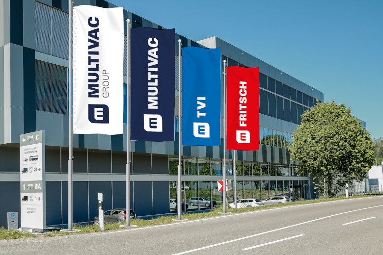
MULTIVAC unveiled the group’s new corporate design, which connects the companies in the group. The rebranding is rolled in steps, starting with the new company logos. Notably, the new design moves on from the previous individual logos of each company, which are replaced by the Group’s ‘M’. M represents the group, and unique colors are used for the names of its companies: indigo for MULTIVAC, its traditional red for FRITSCH and light blue for TVI. ‘M’ in the group’s new logo also symbolizes ‘more’, MULTIVAC says (more solutions, more products and services, more efficiency).
“The first project is the relaunch of the website with the new branding, which will now gradually go live in up to 80 countries. In the coming months, the new design of our group will then also be visible in other media,” MULTIVAC announced on LinkedIn. The new visual identity will make its debut at interpack 2023.
“A uniform overall image with great recognition value helps us to present the contribution of the individual companies of the MULTIVAC Group coherently, even internationally. As a group of companies, we can thus also present ourselves together as a technology leader when it comes to overarching topics such as automation, digitalization and sustainability,” explains Tobias Richter.
Photo: MULTIVAC


