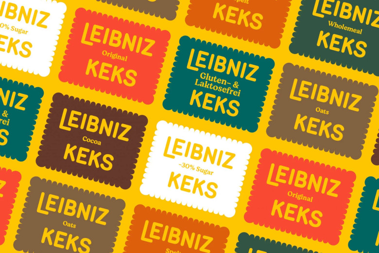
 Germany’s Bahlsen worked with branding design agency Auge Design to revamp the branding of its Leibniz biscuits. The new visuals aim to better relate to young generations and express the biscuits’ naturalness and taste. The iconic brand’s warmth was preserved, refreshing the sunflower tone of yellow color used since 1891, when Hermann Bahlsen launched the original design. Its simple and distinctive design was defined by the 52 “teeth” frame, the rectangular field on which “LEIBNIZ BUTTERKEKS” is imprinted in capital letters. The original rounded style was kept for the brand logo, with ‘LEIBNIZ BUTTERKEKS’ stamped and baked onto the biscuits. To represent the new natural direction of the brand, the outer case has the name of each of the six ranges and flavors printed on it with the corresponding color.
More than 130 years since launch, Bahlsen has an international presence with its biscuits, waffles, chocolate bars and cakes, employing 2,750 people, with a turnover of EUR 540 million in 2019.

Photo: Auge Design